配信中のチャット欄を配信画面に表示して、より配信を楽しく魅せるために、チャットをアニメーション表示するカスタマイズ方法について紹介します。
StreamlabsのチャットボックスウィジェットでカスタムHTML/CSSを使う方法になるので、少し難しい部分もあるかもしれませんが、なるべくコピペで済むように作っているので、ぜひ挑戦してみてください!
前提条件
このページで紹介しているカスタマイズ用コードは、利用にあたりいくつかの前提条件があります。
1. Streamlabs.comのチャットボックスウィジェットを使用する
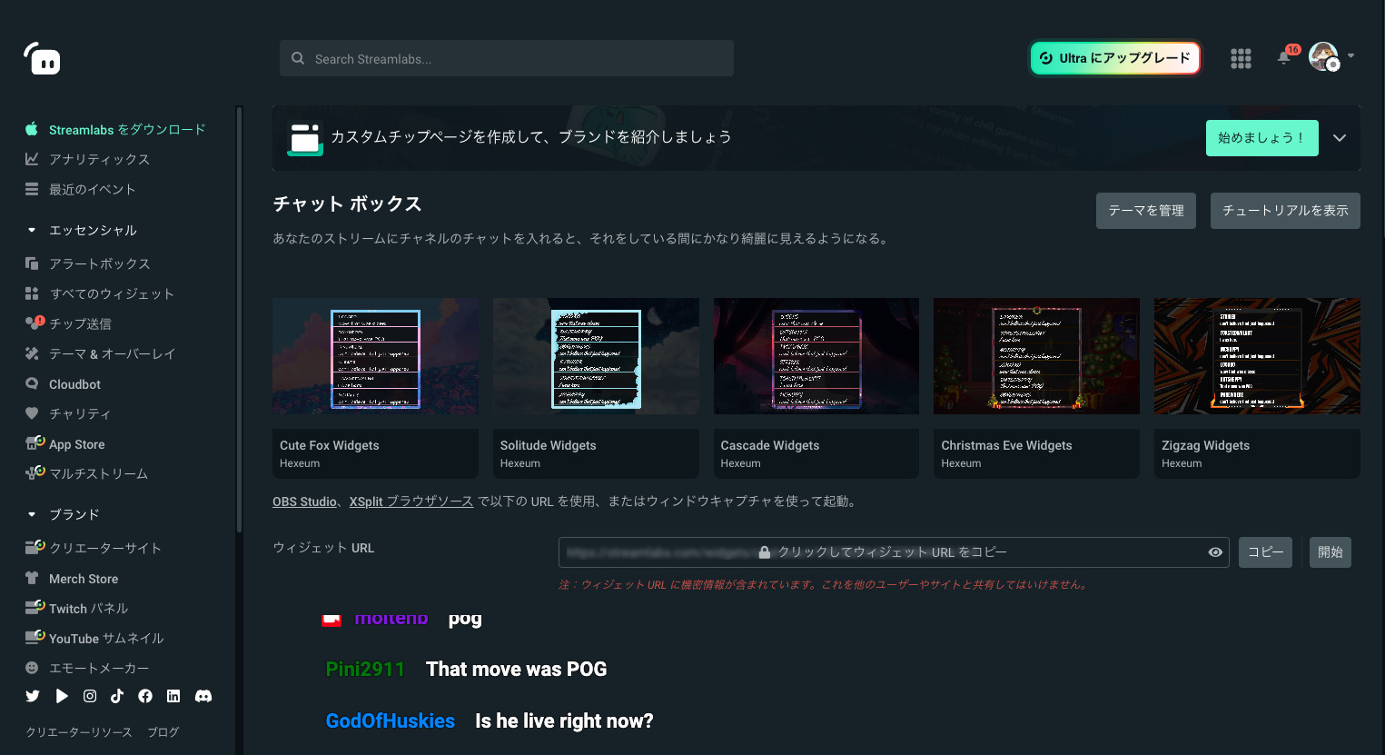
紹介しているコードはStreamlabs.comのチャットボックスウィジェットで動作確認をしています。その他のツールでは動作の保証はありません。
2. カスタムHTML/CSSを使用する
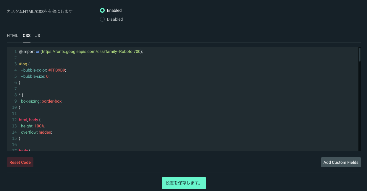
チャットボックス設定の一番下にある「カスタムHTML/CSSを有効にします」を「Enable」にし、その下に表示される「HTML」「CSS」「JS」のタブで表示されるコードをカスタマイズします。
基本的には対応する「HTML」「CSS」「JS」の中身を消してカスタマイズコードをコピー&ペーストしてください。
(※フォントのカスタマイズのみの場合、「CSS」の中身を消さず、先頭に追記するだけで大丈夫です)
紹介するコードで「JS」のコードが紹介されていないものは「JS」タブのコードは消さず、そのままにしておいてください。
3. メッセージの自動非表示非対応/文字色や背景色設定はものによって反映されないものがあります
ウィジェットの設定にある「後のメッセージを非表示します。」の設定は基本的に無視されるようになっています。そのため、一定時間後にチャットを非表示にできず、ずっと表示されたままになります。
また、カスタマイズによっては色設定などは反映されない場合があるのでご注意ください。
チャットボックスカスタマイズコード
フォントだけ変える系カスタマイズ
フォント(文字の形)を変えるだけのお手軽カスタマイズです。
Google Fontsを使ったカスタマイズになります。
「CSS」の先頭に数行追加するだけの簡単カスタマイズなので、ぜひチャレンジしてみてください!
※「コピペでOK」という簡単さを優先しているため、やや力技な部分もありますが、CSSがわかる方は適宜調整してください。
丸文字系①
@import url('https://fonts.googleapis.com/css2?family=M+PLUS+Rounded+1c:wght@400;700&display=swap');

body {
  font-family: 'M PLUS Rounded 1c',sans-serif !important;
}
/* ▲▲▲ CSSタブの先頭に追記!  */
丸文字系②
@import url('https://fonts.googleapis.com/css2?family=Kosugi+Maru&display=swap');

body {
  font-family: 'Kosugi Maru',sans-serif !important;
}
/* ▲▲▲ CSSタブの先頭に追記!  */
ドット文字
@import url('https://fonts.googleapis.com/css2?family=DotGothic16&display=swap');

body {
  font-family: 'DotGothic16', sans-serif !important;
}
/* ▲▲▲ CSSタブの先頭に追記!  */
縁取り文字
@import url('https://fonts.googleapis.com/css2?family=Rampart+One&display=swap');

body {
  font-family: 'Rampart One', cursive !important;
}
/* ▲▲▲ CSSタブの先頭に追記!  */
太文字系①
@import url('https://fonts.googleapis.com/css2?family=RocknRoll+One&display=swap');

body {
  font-family: 'RocknRoll One', sans-serif !important;
}
/* ▲▲▲ CSSタブの先頭に追記!  */
太文字系②
@import url('https://fonts.googleapis.com/css2?family=Dela+Gothic+One&display=swap');

body {
  font-family: 'Dela Gothic One', cursive !important;
}
/* ▲▲▲ CSSタブの先頭に追記!  */
太文字系③
@import url('https://fonts.googleapis.com/css2?family=Mochiy+Pop+P+One&display=swap');

body {
  font-family: 'Mochiy Pop P One', sans-serif !important;
}
/* ▲▲▲ CSSタブの先頭に追記!  */
シンプル系カスタマイズ
ネオンテキスト
アニメーションはありませんが、ネオンっぽいメッセージ欄にするカスタマイズです。
<!-- item will be appened to this layout -->
<div id="log" class="sl__chat__layout">
</div>

<!-- chat item -->
<script type="text/template" id="chatlist_item">
  <div data-from="{from}" data-id="{messageId}" style="--neon-color: {color};">
    <span class="meta" >
      <span class="badges">
      </span>
      <span class="name">{from}</span>
    </span>

    <span class="message">
      {message}
    </span>
  </div>
</script>
@import url(https://fonts.googleapis.com/css?family=Roboto:700);
* {
box-sizing: border-box;
}
html, body {
height: 100%;
overflow: hidden;
}
body {
text-shadow: 0 0 1px #000, 0 0 2px #000;
font-family: 'Roboto', sans-serif;
font-weight: 700;
line-height: 1.5em;
font-size: {font_size};
background: {background_color};
color: {text_color};
}
/*
#log>div {
animation: fadeInRight .3s ease forwards, fadeOut 0.5s ease forwards;
-webkit-animation: fadeInRight .3s ease forwards, fadeOut 0.5s ease forwards;
}
*/
.colon {
display: none;
}
#log {
display: block;
position: absolute;
bottom: 0;
left: 0;
padding: 0 10px 10px;
width: 100%;
table-layout: fixed;
}
#log > div {
display: flex;
}
#log > div + div {
margin-top: 0.5em;
}
#log > div.deleted {
visibility: hidden;
}
#log .emote {
background-repeat: no-repeat;
background-position: center;
background-size: contain;
padding: 0.4em 0.2em;
position: relative;
}
#log .emote img {
display: inline-block;
height: 1em;
opacity: 0;
}
#log .message, #log .meta {
padding-bottom: 0.1em;
}
#log .meta {
text-align: right;
padding-right: 0.5em;
white-space: nowrap;
text-overflow: ellipsis;
overflow: hidden;
}
#log .message {
word-wrap: break-word;
}
.badge {
display: inline-block;
margin-right: 0.2em;
position: relative;
height: 1em;
vertical-align: middle;
top: -0.1em;
}
.name {
margin-left: 0.2em;
}
.message,
.name {
text-shadow: 0 0 0.5em #fff,
0 0 0.2em var(--neon-color),
0 0 0.4em var(--neon-color)
}
ふわっと表示
コメントがふわっと表示されるタイプです
<!-- item will be appened to this layout -->
<div id="log" class="sl__chat__layout">
</div>

<!-- chat item -->
<script type="text/template" id="chatlist_item">
  <div data-from="{from}" data-id="{messageId}">
    <span class="meta" style="color: {color}">
      <span class="badges"></span>
      <span class="name">{from}</span>
    </span>
    <span class="message">{message}</span>
  </div>
</script>
@import url(https://fonts.googleapis.com/css?family=Roboto:700);
* {
box-sizing: border-box;
}
html, body {
height: 100%;
overflow: hidden;
}
body {
text-shadow: 0 0 1px #000, 0 0 2px #000;
background: {background_color};
font-family: 'Roboto',sans-serif;
font-weight: 700;
font-size: {font_size};
line-height: 1.5em;
color: {text_color};
}
#log>div {
display: flex;
margin-top: 0.25em;
animation: huwatto ease-out 0.5s both;
}
.colon {
display: none;
}
#log {
position: absolute;
bottom: 0;
left: 0;
padding: 0 10px 10px;
width: 100%;
}
#log>div.deleted {
visibility: hidden;
}
#log .emote {
background-repeat: no-repeat;
background-position: center;
background-size: contain;
padding: 0.4em 0.2em;
position: relative;
}
#log .emote img {
display: inline-block;
height: 1em;
opacity: 0;
}
#log .message,#log .meta {
padding-bottom: 0.1em;
}
#log .meta {
text-align: right;
padding-right: 0.5em;
white-space: nowrap;
text-overflow: ellipsis;
overflow: hidden;
}
#log .message {
word-wrap: break-word;
}
.badge {
display: inline-block;
margin-right: 0.2em;
position: relative;
height: 1em;
vertical-align: middle;
top: -0.1em;
}
.name {
margin-left: 0.2em;
}
@keyframes huwatto {
0% {
opacity: 0;
}
100% {
opacity: 1;
}
}シャキッと系カスタマイズ
ちょっとかっこいい系のシャキッとしたアニメーションのカスタマイズです。
帯からコメント登場
<!-- item will be appened to this layout -->
<div id="log" class="sl__chat__layout">
</div>

<!-- chat item -->
<script type="text/template" id="chatlist_item">
  <div data-from="{from}" data-id="{messageId}">
    <span class="meta" style="color: {color}">
      <span class="badges">
      </span>
      <span class="name">{from}</span>
    </span>

    <span class="message">
      {message}
    </span>
  </div>
</script>
@import url(https://fonts.googleapis.com/css?family=Roboto:700);
* {
box-sizing: border-box;
}
body {
/* 帯色をカスタマイズ 16進数のカラーコードで指定 */
--line-color:#000;
}
html, body {
height: 100%;
overflow: hidden;
}
body {
text-shadow: 0 0 1px #000, 0 0 2px #000;
font-family: 'Roboto', sans-serif;
font-weight: 700;
line-height: 1.5em;
font-size: {font_size};
background: {background_color};
color: {text_color};
}
/*
#log>div {
animation: fadeInRight .3s ease forwards, fadeOut 0.5s ease forwards;
-webkit-animation: fadeInRight .3s ease forwards, fadeOut 0.5s ease forwards;
}
*/
.colon {
display: none;
}
#log {
display: block;
position: absolute;
bottom: 0;
left: 0;
padding: 0 10px 10px;
width: 100%;
table-layout: fixed;
}
#log > div {
position: relative;
display: flex;
overflow: hidden;
}
#log > div:before {
content: "";
display: block;
width: 100%;
height: 100%;
position: absolute;
top: 0;
left: 0;
background-color: var(--line-color);
animation: lineAnimation 0.5s ease-in-out both;
z-index: 2;
}
#log > div + div {
margin-top: 0.5em;
}
#log > div.deleted {
visibility: hidden;
}
#log > div > * {
animation: fadeInText 0.1s ease-in-out 0.4s both;
}
#log .emote {
background-repeat: no-repeat;
background-position: center;
background-size: contain;
padding: 0.4em 0.2em;
position: relative;
}
#log .emote img {
display: inline-block;
height: 1em;
opacity: 0;
}
#log .message, #log .meta {
padding-bottom: 0.1em;
}
#log .meta {
text-align: right;
padding-right: 0.5em;
white-space: nowrap;
text-overflow: ellipsis;
overflow: hidden;
}
#log .message {
word-wrap: break-word;
}
.badge {
display: inline-block;
margin-right: 0.2em;
position: relative;
height: 1em;
vertical-align: middle;
top: -0.1em;
}
.name {
margin-left: 0.2em;
}
@keyframes lineAnimation {
0% {
width: 100%;
transform: translateX(100%);
}
50% {
width: 100%;
transform: translateX(0);
}
99% {
opacity: 1;
}
100% {
width: 0;
opacity: 0;
}
}
@keyframes fadeInText {
0% {
opacity: 0;
}
100% {
opacity: 1;
}
}
かわいい系カスタマイズ
水しぶきが跳ねる
ふわっとチャットが現れて左上にちょこっと水しぶきっぽいアニメーションが出るタイプです。
水しぶきが大きいとちょっと野暮ったいけど、小さいと見えづらそう…というなかなかもどかしいタイプです…
<!-- item will be appened to this layout -->
<div id="log" class="sl__chat__layout">
</div>

<!-- chat item -->
<script type="text/template" id="chatlist_item">
  <div data-from="{from}" data-id="{messageId}">
    <span class="meta" style="color: {color}">
      <span class="badges"></span>
      <span class="name">{from}</span>
    </span>
    <span class="message">{message}</span>
    <ul class="bubble">
      <li></li>
      <li></li>
      <li></li>
      <li></li>
    </ul>
  </div>
</script>
@import url(https://fonts.googleapis.com/css?family=Roboto:700);
#log {
/* 水しぶきの色をカスタマイズ 16進数のカラーコードで指定 */
--bubble-color: #FF7878;
}
* {
box-sizing: border-box;
}
html, body {
height: 100%;
overflow: hidden;
}
body {
/* text-shadow: 0 0 1px #000, 0 0 2px #000; */
background: {background_color};
font-family: 'Roboto', sans-serif;
font-weight: 700;
font-size: {font_size};
line-height: 1.5em;
color: {text_color};
}
#log > div {
display: flex;
gap: 0.5em;
position: relative;
margin-top: 1em;
margin-left: 2em;
animation: fadeIn ease-in 0.5s both;
}
.colon {
display: none;
}
#log {
display: flex;
flex-direction: column;
align-items: flex-start;
position: absolute;
bottom: 0;
left: 0;
padding: 0 10px 10px;
width: 100%;
table-layout: fixed;
}
#log > div {
display: flex;
}
#log > div.deleted {
visibility: hidden;
}
#log .emote {
background-repeat: no-repeat;
background-position: center;
background-size: contain;
padding: 0.4em 0.2em;
position: relative;
}
#log .emote img {
display: inline-block;
height: 1em;
opacity: 0;
}
#log .message, #log .meta {
vertical-align: top;
display: table-cell;
padding-bottom: 0.1em;
}
#log .meta {
text-align: right;
padding-right: 0.5em;
white-space: nowrap;
text-overflow: ellipsis;
overflow: hidden;
}
#log .message {
word-wrap: break-word;
}
.badge {
display: inline-block;
margin-right: 0.2em;
position: relative;
height: 1em;
vertical-align: middle;
top: -0.1em;
}
.name {
margin-left: 0.2em;
}
.bubble {
position: absolute;
top: 0;
left: 0;
list-style: none;
padding: 0;
margin: 0;
}
.bubble li {
width: 1em;
height: 1em;
position: absolute;
top: 0;
left: 0;
font-size: 0;
background-color: var(--bubble-color);
border-radius: 50%;
z-index: 2;
animation-delay: 0.3s;
}
.bubble li:nth-child(1) {
background-color: transparent;
border: 1px solid var(--bubble-color);
animation: bubble-1 ease 0.5s both;
}
.bubble li:nth-child(2) {
animation: bubble-2 ease 0.5s both;
}
.bubble li:nth-child(3) {
background-color: transparent;
border: 1px solid var(--bubble-color);
animation: bubble-3 ease 0.5s both;
}
.bubble li:nth-child(4) {
animation: bubble-4 ease 0.5s both;
}
@keyframes bubble-1 {
0% {
top: 0;
left: 0;
opacity: 0;
font-size: 0;
}
50% {
font-size: 6px;
opacity: 1;
}
80% {
top: -10px;
opacity: 1;
}
100% {
top: -15px;
opacity: 0;
}
}
@keyframes bubble-2 {
0% {
top: 0;
left: 0;
opacity: 0;
font-size: 0;
}
50% {
font-size: 4px;
opacity: 1;
}
80% {
top: -8px;
left: -8px;
opacity: 1;
}
100% {
top: -12px;
left: -10px;
opacity: 0;
}
}
@keyframes bubble-3 {
0% {
top: 0;
left: 0;
opacity: 0;
font-size: 0;
}
50% {
font-size: 6px;
opacity: 1;
}
80% {
top: -3px;
left: -12px;
opacity: 1;
}
100% {
top: -5px;
left: -17px;
opacity: 0;
}
}
@keyframes bubble-4 {
0% {
top: 0;
left: 0;
opacity: 0;
font-size: 0;
}
50% {
font-size: 4px;
opacity: 1;
}
80% {
top: 5px;
left: -12px;
opacity: 1;
}
100% {
top: 8px;
left: -15px;
opacity: 0;
}
}
@keyframes fadeIn {
0% {
opacity: 0;
}
100% {
opacity: 100%;
}
}
@keyframes bubble-1 ~ bubble-4の中にあるfont-sizeで丸の大きさを制御しているので、興味があればサイズ調整等試してみてください!
宣伝
今後、いろいろ試しながらカスタマイズコードを作っていきますのでお楽しみに!
開発の様子は時々お昼にTwitchで配信をしていますのでもしよかったらのぞいてみてください👀

Twitter(@yosiakatsuki_gm)もよろしくです!